Intro
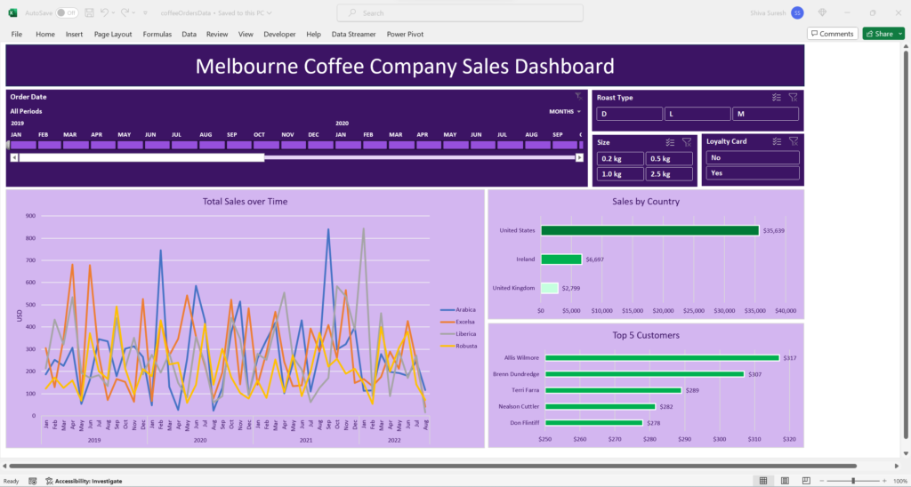
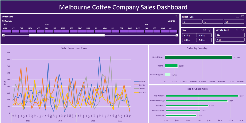
In this end to end Excel data project, we gather data, transform it then use pivot tables and pivot charts to build a dynamic interactive coffee sales dashboard.
Problem Statement
Our stakeholders have requested a dashboard that analyzes the following:
1. Total coffee sales over time by coffee type.
2. Coffee sales by country
3. Top customers
The stakeholders want the capability to filter this dashboard by:
1. Time
2. Coffee roast colors
3. Coffee bean size
4. Customers using loyalty cards
Dataset
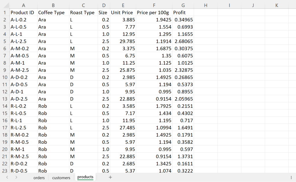
The coffee dataset has 3 tables which are organized in Excel sheet tabs:
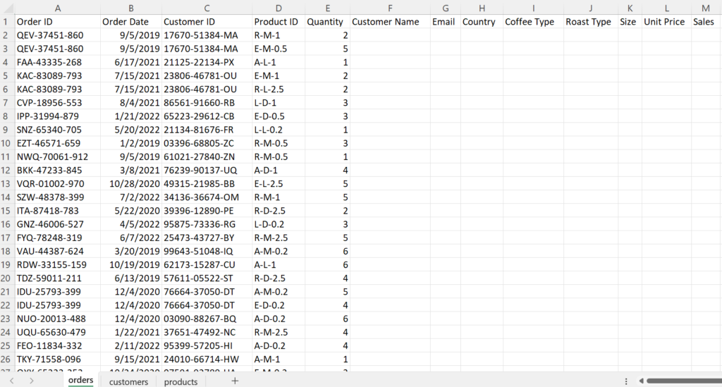
1. Orders
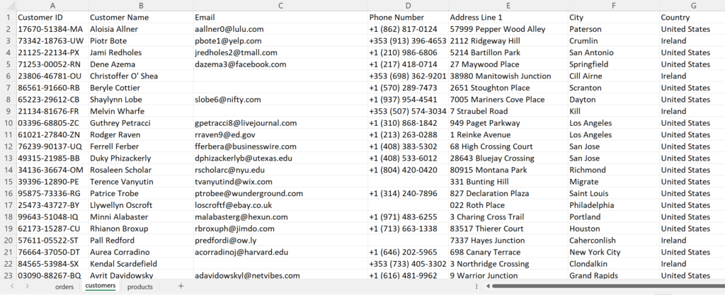
2. Customers
3. Products
Transformations
In order to prepare the data for analysis, we need to make some transformations since the information we need is spread across different tables.
Retrieve Data from Customers table with XLOOKUP
To start our transformations, we will use XLOOKUP, INDEX, and MATCH functions to retrieve data into the Orders table from the Customers and Products tables.
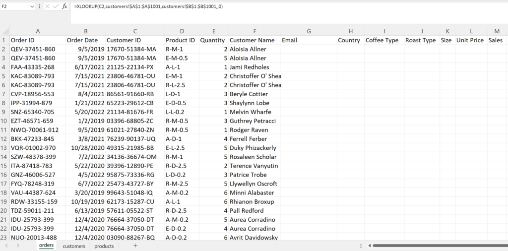
We need to bring in the Customer Name, Email, and Country data from the Customers table into the Orders table. We can use XLOOKUP to do this.
First, let’s pull in the Customer Name.
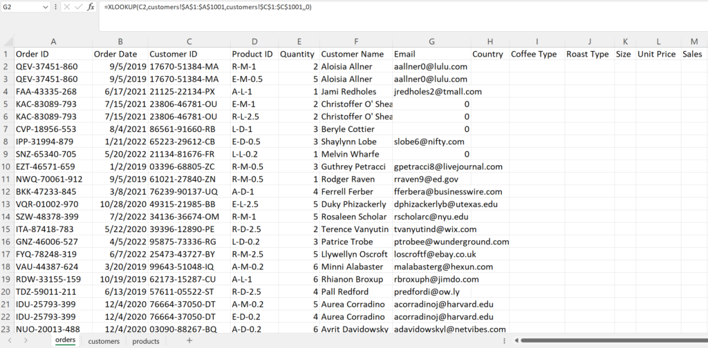
Next, let’s retrieve the Email. You can see that there are “0” values in the Email column. Not all customers have an email address. Because of this, the XLOOKUP formula returns a “0” when it encounters a blank email address. We don’t want to leave these zeroes in the data.
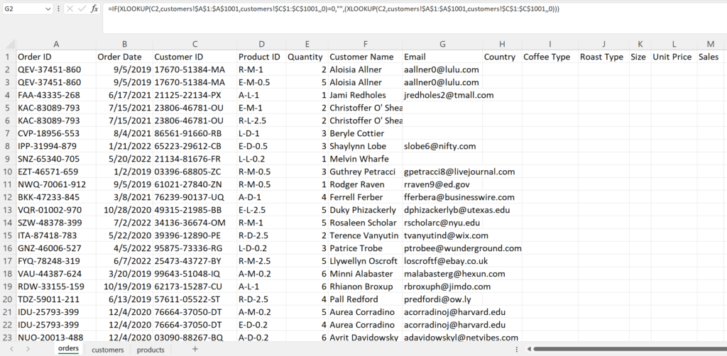
Let’s adjust our formula to include an IF clause which will return nothing if the XLOOKUP is equal to “0” otherwise it will return the XLOOKUP value.
Finally, let’s get Country
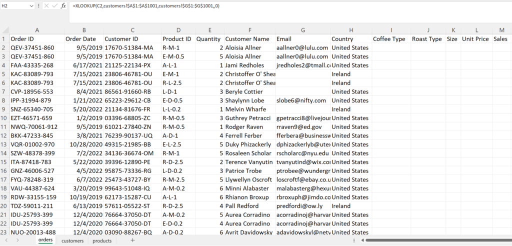
Retrieving Data from the Products Table with INDEX MATCH
So far, we have used XLOOKUP to retrieve Customer Name, Email, and Country from the Customers table. It has worked pretty well but we had to write the XLOOKUP formula 3 separate times. Is there a way to avoid this?
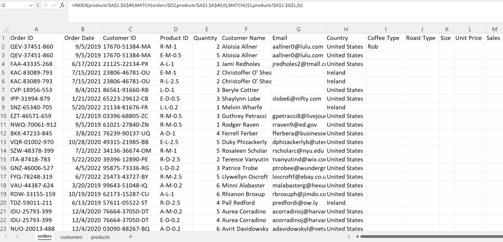
Let’s try something a bit different when retrieving the Coffee Type, Roast Type, Size, and Unit Price from the Products table. We can use INDEX MATCH which is a bit more complicated to set up but the upside is INDEX MATCH is dynamic. We only have to write the formula once then we can copy it across and down.
Below, the INDEX MATCH formula was used to populate the Coffee Type from the Products table into the cell I2 of the Orders table with the value “Rob” which is short for “Robusta”.
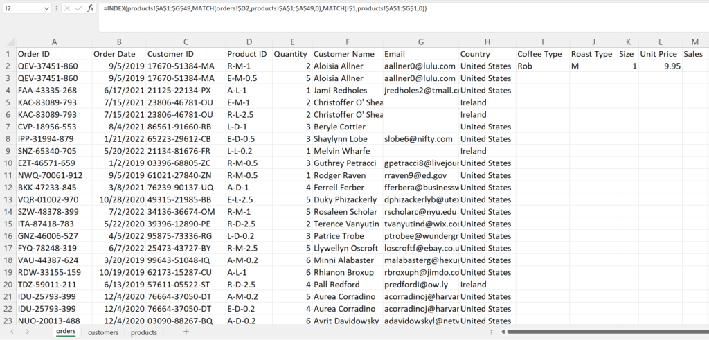
Now, we can just drag the INDEX MATCH formula in cell I2 to the right to dynamically populate the remaining columns in the row instead of writing the formula 3 more times.
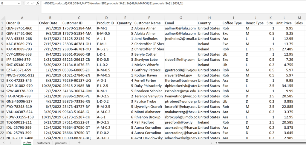
Similarly, we can copy the formula down to the remaining rows by highlighting cells I2 through L2 then clicking the plus sign at the bottom right of cell L2.
Calculating Sales
With the product data retrieved into the Orders sheet, we can calculate Sales by multiplying Quantity by Unit Price.
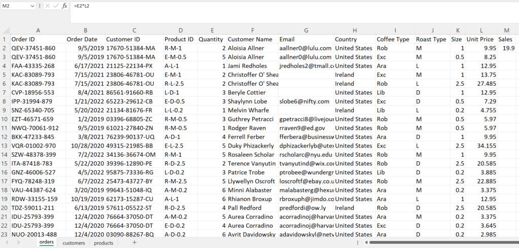
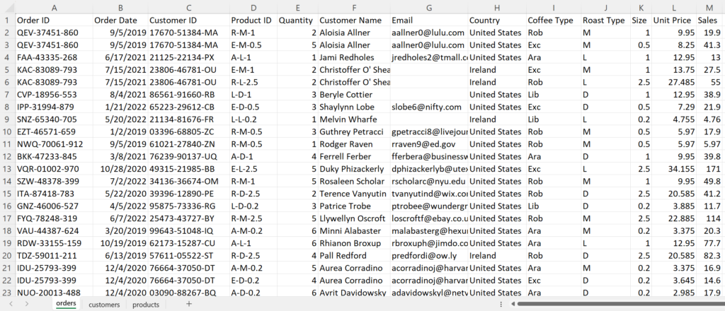
Next, we copy the sales calculation down by double clicking the plus sign at the lower right of cell M2.
Convert Coffee Type Abbreviation
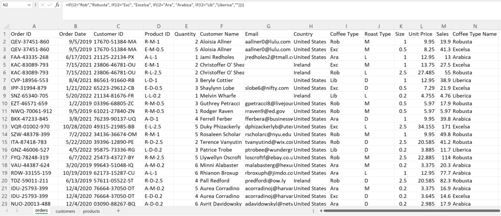
Currently, the Coffee Type in column I has names with 3 letter abbreviations. To make this more readable, we use multiple IF functions to convert the abbreviations to full names. Let’s create a new column Coffee Type Name to make the transformation.
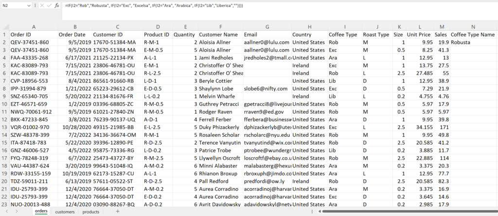
Once again, we double click the plus sign at the bottom right of N2 to populate the values to the rest of the rows.
Convert Roast Type Abbreviation
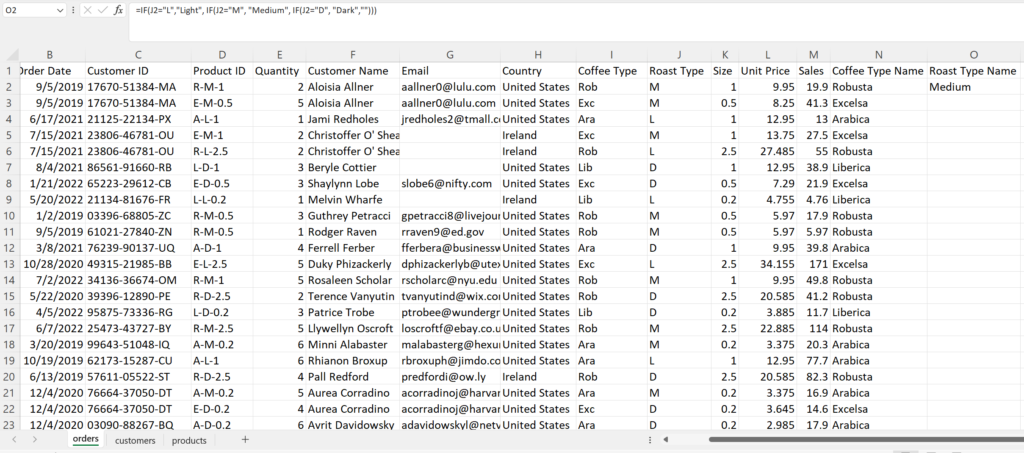
The Roast Type in column J has abbreviations L, M, D for Light, Medium, Dark. Once again for added readability, let’s transform these to their full name. Let’s give column O the header “Coffee Type Name” then once again use multiple IF functions to replace the abbreviated values.
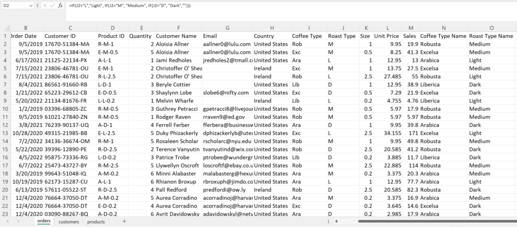
Next, double click the plus sign at the bottom of cell O2 to fill the values to the rows below.
Date Formatting
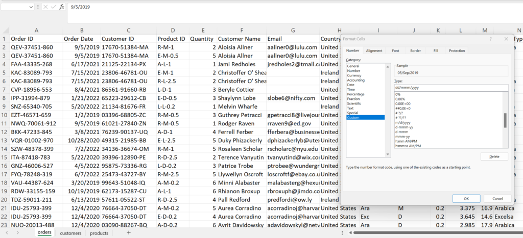
The Order Dates in column B are currently in dd/mm/yyyy format. The business requires the months to be in abbreviated letters i.e “Mar”. Let’s transform the date format using the Custom format option to change to dd-mmm-yyyy.
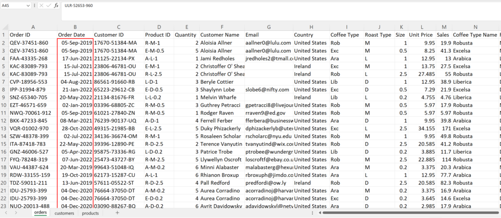
Now, the dates have been transformed to the new format
Number Formatting
The Size column is a number with one decimal but the business requires these numbers to be displayed with “kg” appended to the end of the number. Once again, let’s use a Custom format to achieve this.
In the Custom Format dialog box, 0.0 is specified to indicate a one decimal number. Next, add a space then “kg”.
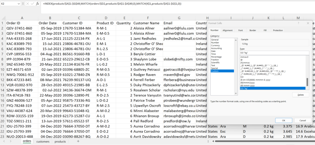
Now, the Size column values are displayed with “kg” appended which improves readability for the audience.
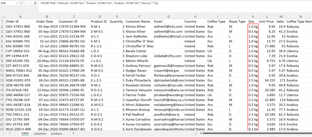
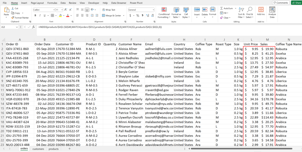
I also want to format the Unit Price and Sales into USD which is easily done by highlighting the Unit Price and Sales columns then going to the Home tab then changing the currency to $ English (United States)
Check for Duplicates
Next, let’s check for duplicates in the dataset. Click in cell A1 then press Ctrl + Shift + Right Arrow to highlight all the columns in our dataset then press Ctrl + Shift + Down Arrow to highlight all the rows. The entire dataset should now be highlighted.
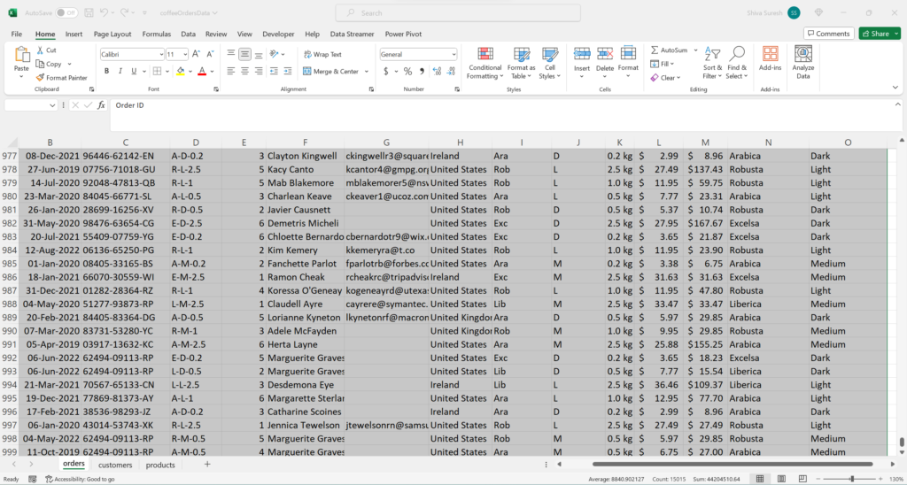
Once the dataset is highlighted, click the Data tab then select “Remove Duplicates” in the Data Tools section. The Remove Duplicates dialog box displays.
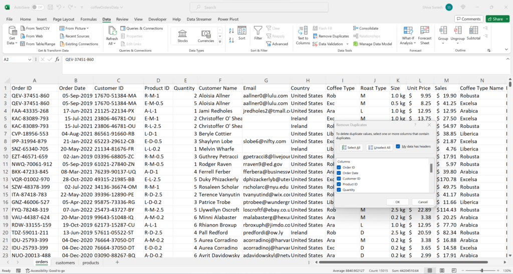
Click, Ok. No duplicates were found so that is good.
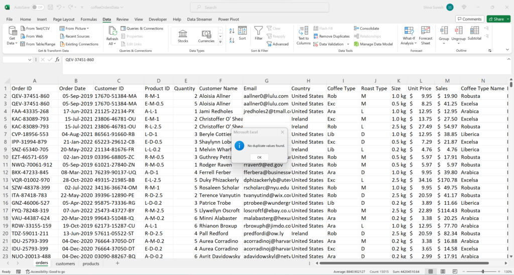
The transformations are now complete.
Convert Range to Table
With the transformations completed, we can begin constructing Pivot Tables and Pivot Charts to begin performing analysis and data visualization. Before doing this, let’s convert the data range to a Table.
Converting the data range to a Table ensures any future rows or columns of data added or removed will be updated in the Pivot Table automatically upon refresh without having to manually change the Pivot Table ranges.
To convert the data range to a Table, press Ctrl + T from any cell in the Orders sheet. A Create Table dialog box will appear. The entire range of the data is displayed by default in the range field of the dialog box. Click Ok.
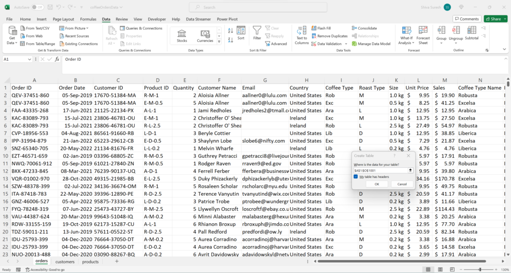
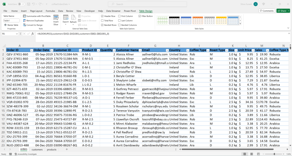
The data range will now be in a Table format. Notice there is a “Table Design” tab visible now after creating the Table.
Data Analysis & Visualization
Create Pivot Table
Now, let’s move to creating a pivot table. With any cell in the Orders table selected, select Insert -> Pivot Table -> From Table/Range which will display the Create Pivot Table dialog box.
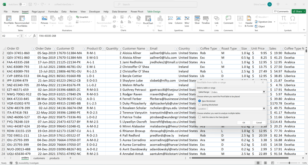
Next, click Ok. The Pivot Table is created in a new worksheet. I also renamed Sheet1 to “TotalSales” and named the pivot table “TotalSales”
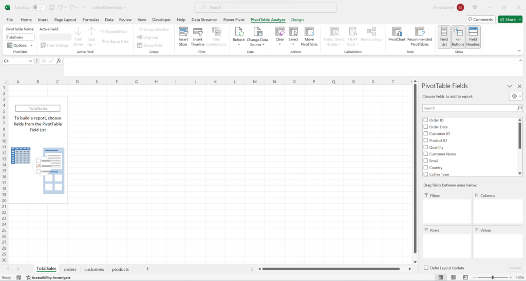
Select Pivot Table Fields
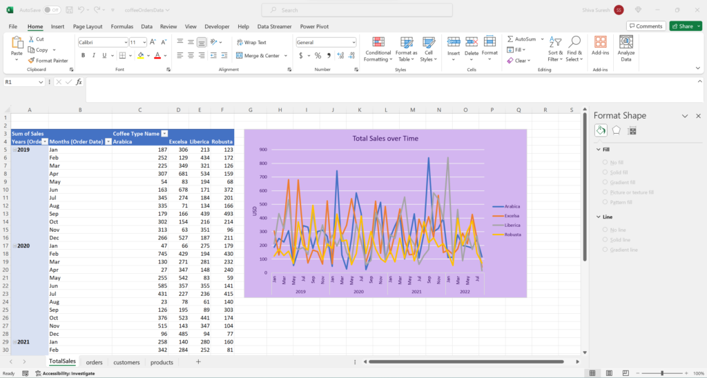
In the PivotTable fields section, “Order Date” is added to Rows. “Coffee Type Roast” is added to Columns. Finally, “Sales” is added to Values.
The Order Date grouping was also changed from year to year and month. Other formatting included removing decimals from Sales values, choosing a tabular format, and removing Grand Totals and Subtotals.
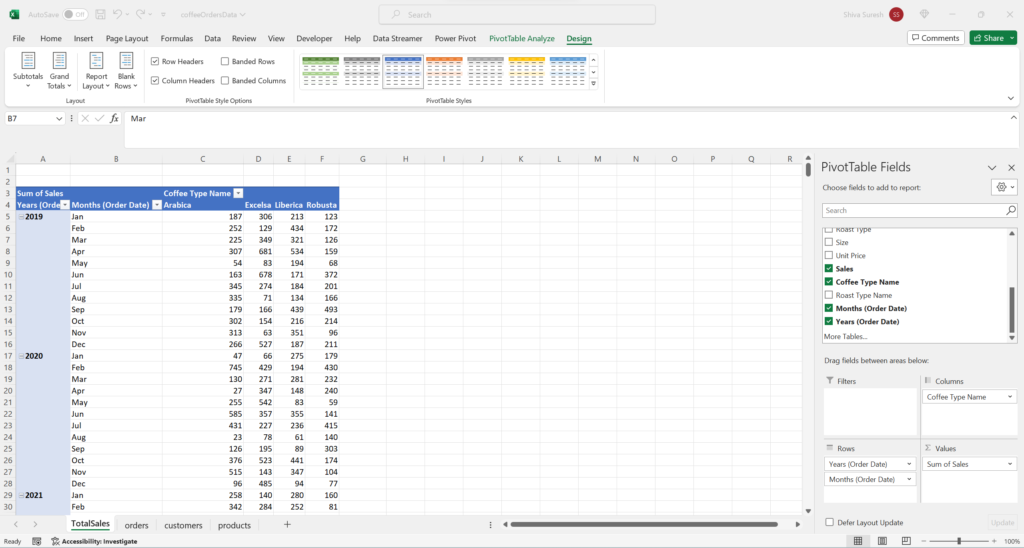
Total Sales Visualization
Now, we are ready to create our first visualization for Total Sales. To do this, select Insert -> Line Chart. After applying various formatting, the Total Sales line chart is below.
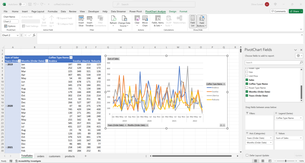
Next, fill color, font color, axis titles, chart title, and line colors are formatted. These are our initial formats which may be adjusted as needed during the dashboard creation process.
Timeline
Since one of the business requirements was the capability to do time based analysis, let’s add a timeline which can be used to filter all the charts by time.
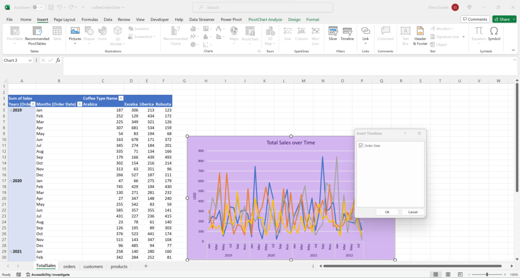
To add a timeline, go to Insert -> Timeline which displays the Insert Timelines dialog box. Select Order Date then click Ok.
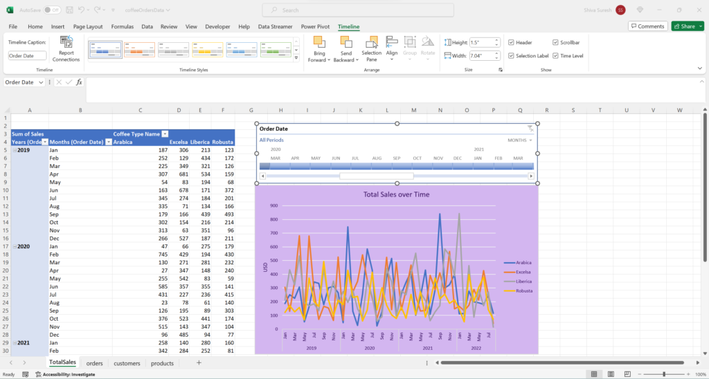
The timeline is inserted.
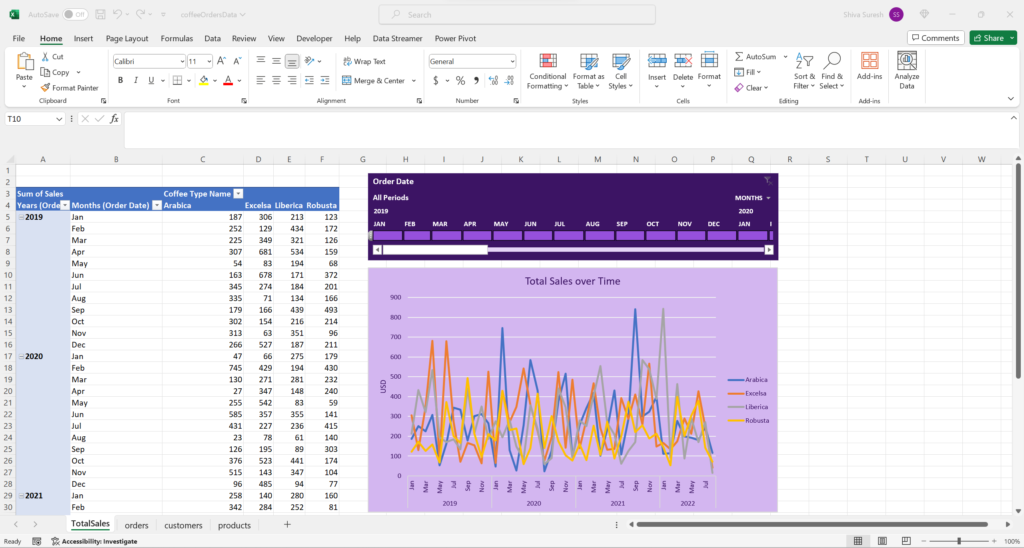
Next, we applied styles and formatting to the Timeline.
Slicers
The stakeholders want the capability to filter the dashboard by Roast Type, Coffee Bean Size, and whether a customer used a Loyalty card or not. Let’s use Slicers to achieve this.
To insert a slicer, go to the Insert tab then select “Slicer” in the Filters section. The Insert Slicers dialog box appears. Select “Roast Type Name” and “Size”. There are some further steps we need to do to prepare the “Loyalty” slicer which we will do a bit later.
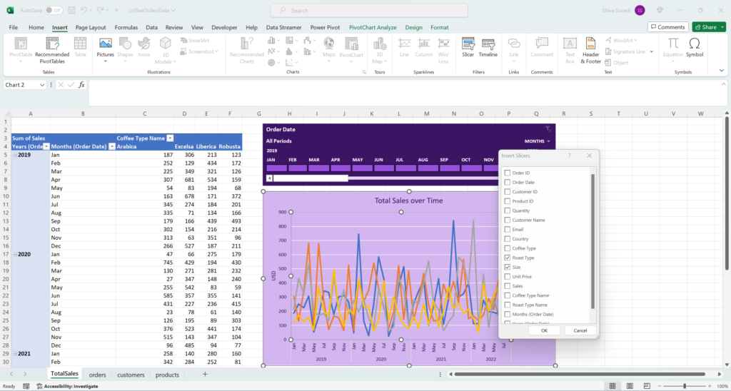
Click Ok. The “Roast Type Name” and “Size” slicers have been inserted.
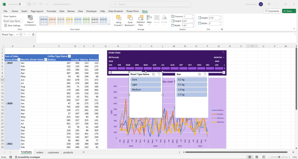
Now, let’s get the Loyalty card data ready so we can create a slicer for it also. In cell P1 of the Orders table, let’s add a column with the header “Loyalty Card”. Notice how the new column is automatically added to the table.
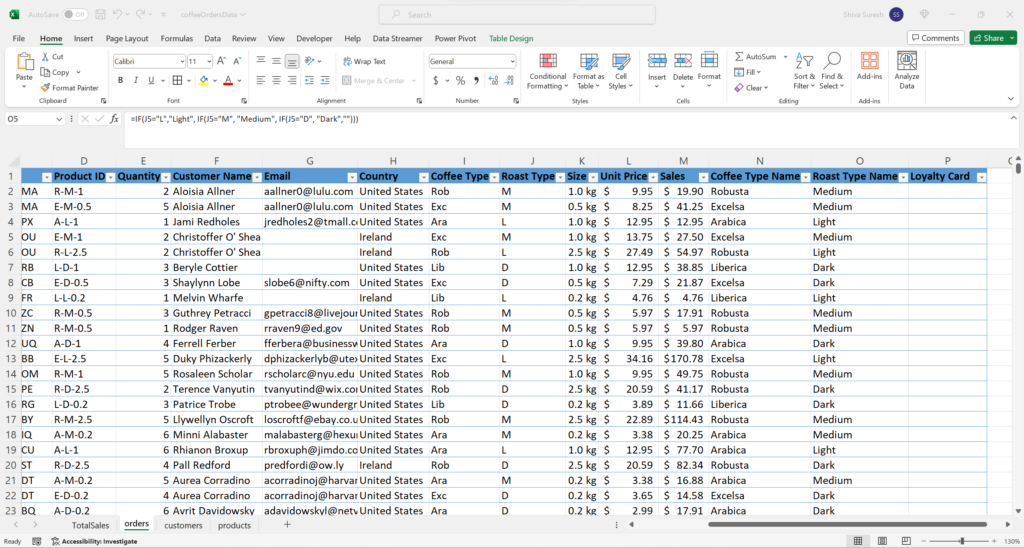
Next, use the XLOOKUP function to retrieve the Loyalty Card values into the Orders table from Customers.
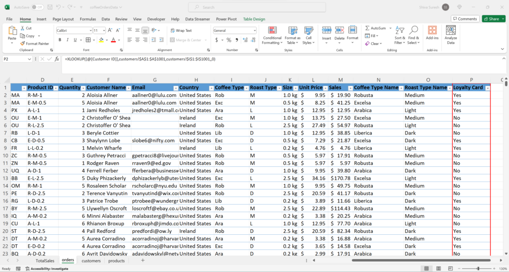
If we look at the current Pivot Table settings for TotalSales sheet, the Loyalty Card field isn’t there.
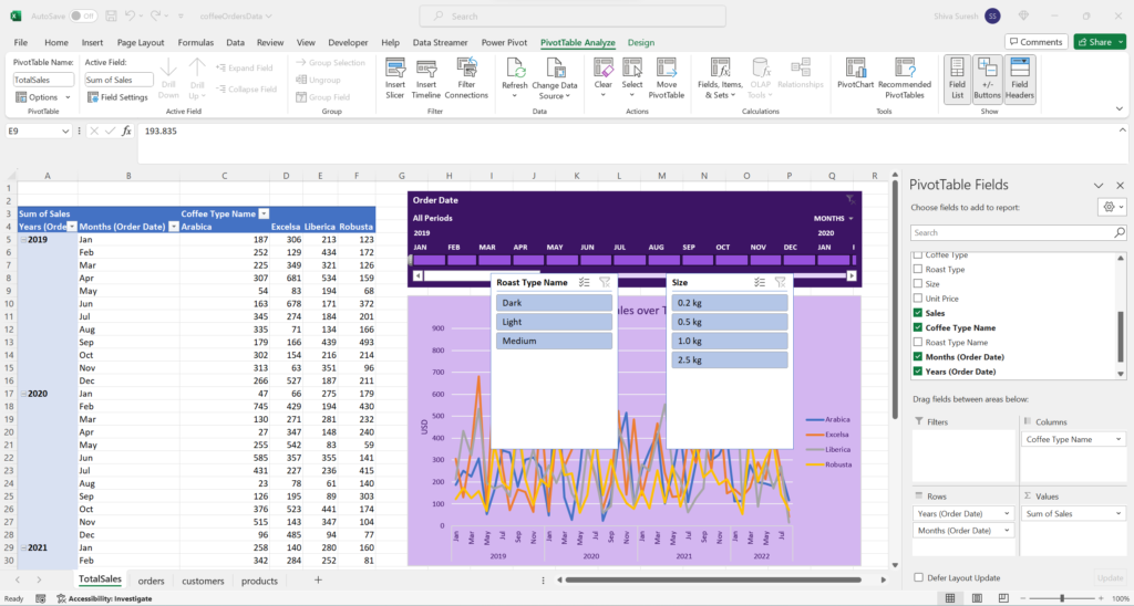
Now, go to PivotTable Analyze -> Refresh then select “Refresh”. The “Loyalty Card” column we added to the Orders table has been added to the pivot table settings without having to manually adjust the pivot table ranges. This is the benefit of using Tables when creating Pivot Tables.
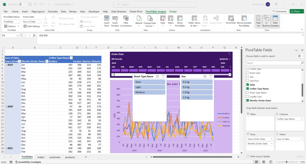
Since the Loyalty Card column is now a part of the Orders table, we can add the Loyalty Card slicer by going to PivotTable Analyze -> Insert Slicer to launch the Insert Slicers dialog box.
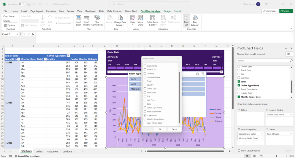
Select “Loyalty Cards” and click Ok. The Loyalty Cards slicer is displayed.
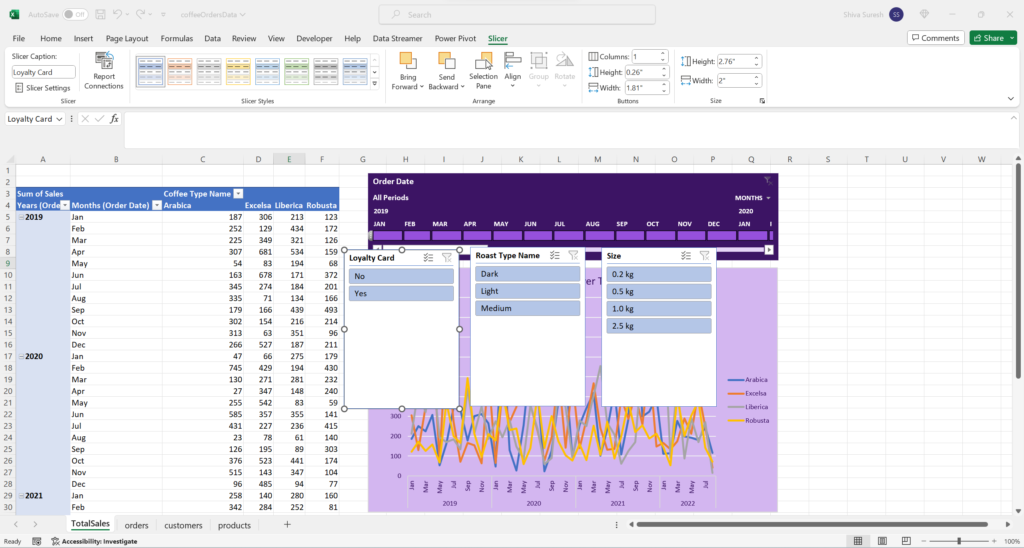
Next, we apply styles and formats to the 3 slicers. We don’t need to worry about arranging the slicers perfectly at this stage since during the final dashboard process we will tidy it all up. For now, we are just assembling all the components.
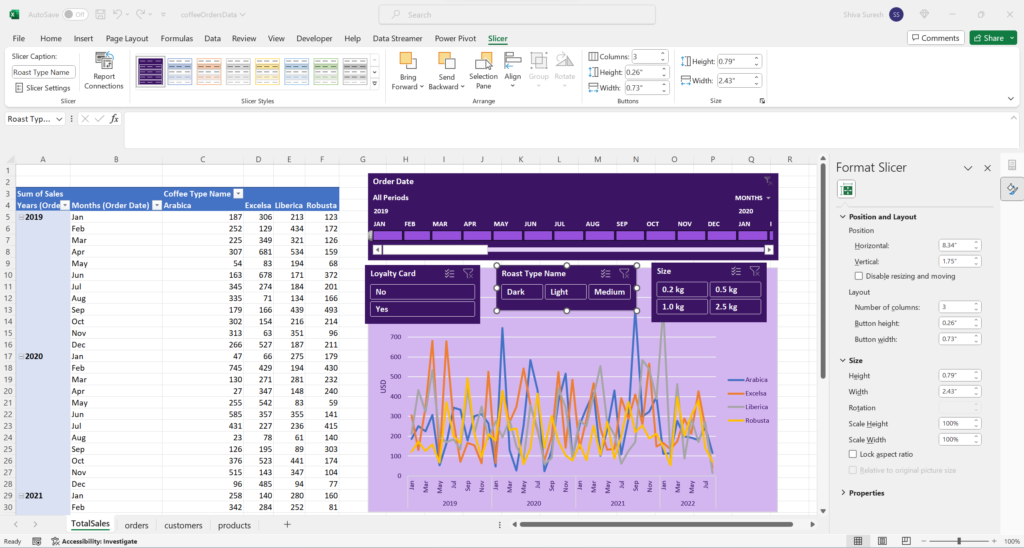
Sales by Country
Next, let’s build the Sales by Country visualization. First, let’s duplicate the TotalSales worksheet then rename it to “CountryBarChart”
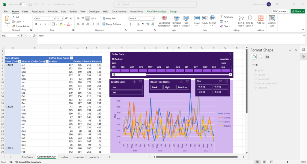
We will be building a new visualization so let’s delete all the existing visuals.
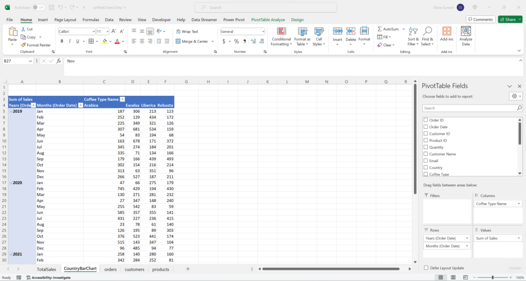
Also, let’s adjust the pivot table settings by clearing the existing fields then putting Country in rows and Sales in values.
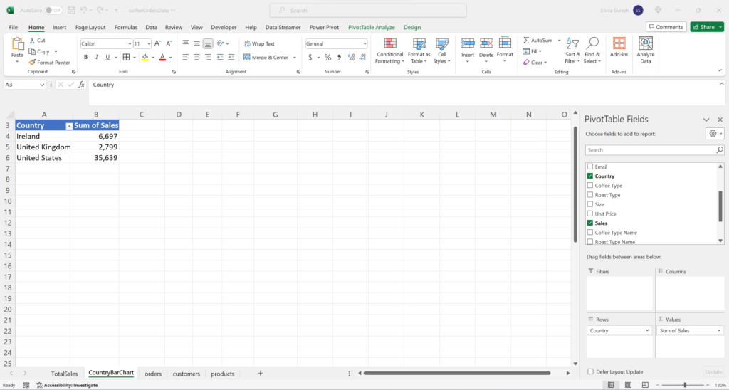
Now, let’s insert a bar chart for Sales by Country. Place the cursor in any cell of the pivot table then go to Insert – > Bar Chart then select the 2D Bar Chart.
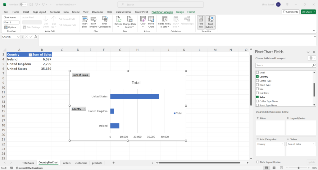
Let’s style and format the bar chart to make it look it a bit nicer.
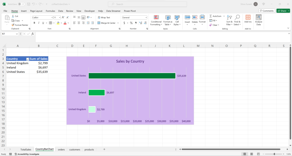
Top 5 Customers
Now, we are ready to build the Top 5 Customers visualization. This time we can duplicate the CountryBarChart sheet then rename it to “Top5Customers”.
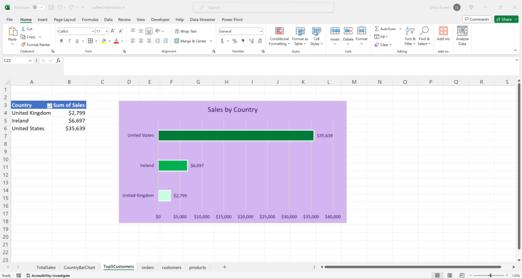
In the PivotChart fields, we change the Axis (categories) from “Country” to “Customer Name”.
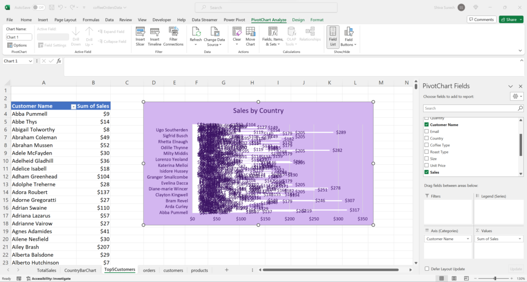
The chart is a bit of a mess so let’s clean this up. Go to the pivot table then click the Customer Name field dropdown at the top then go to Value Filters -> Top 10. The Top 10 Filter dialog box displays.
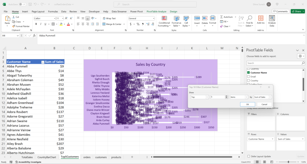
Specify Top 5 Items by Sum of Sales then click Ok.
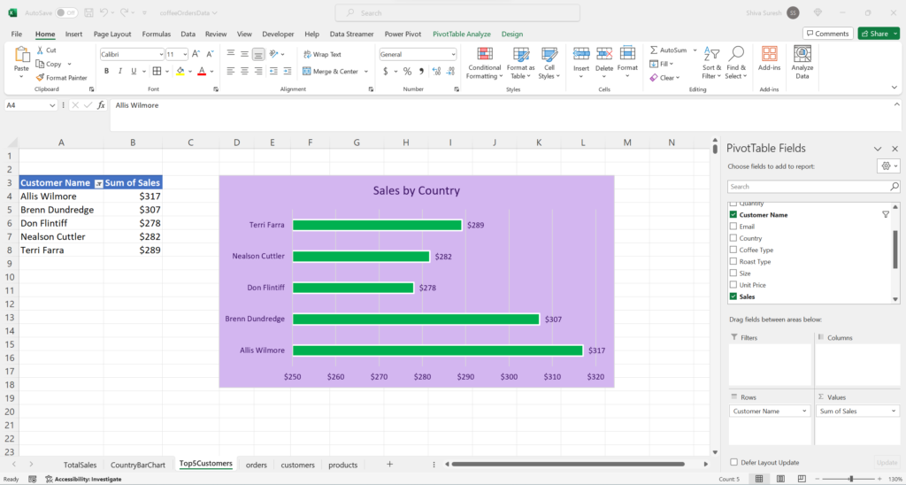
Let’s apply some further styling, formatting, and adjust the sort order.
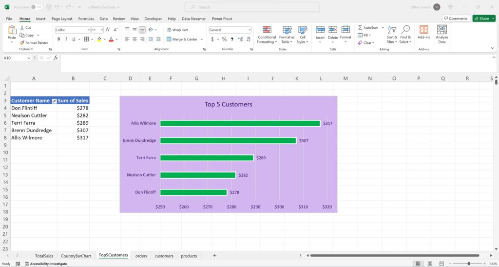
Build the Dashboard
Now that we have created all the individual visualizations, we are ready to put them together into one cohesive dashboard. Let’s create a new sheet then name it Dashboard.
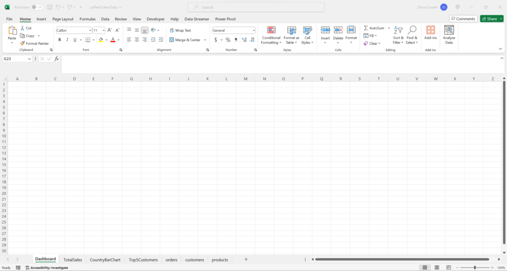
First, change the column A width to 1 and row 1 height to 5

Next, add a dashboard header by going to Insert -> Shapes then selecting the rectangle shape. While pressing the Alt key, drag or extend the shape from B2 to Z5. Using Alt enables the shape to snap to the grid.
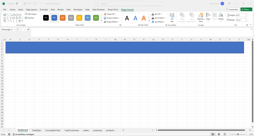
Now, give the shape a purple fill and outline, white font, increase the font size, center text, and add the name “Melbourne Coffee Company”.
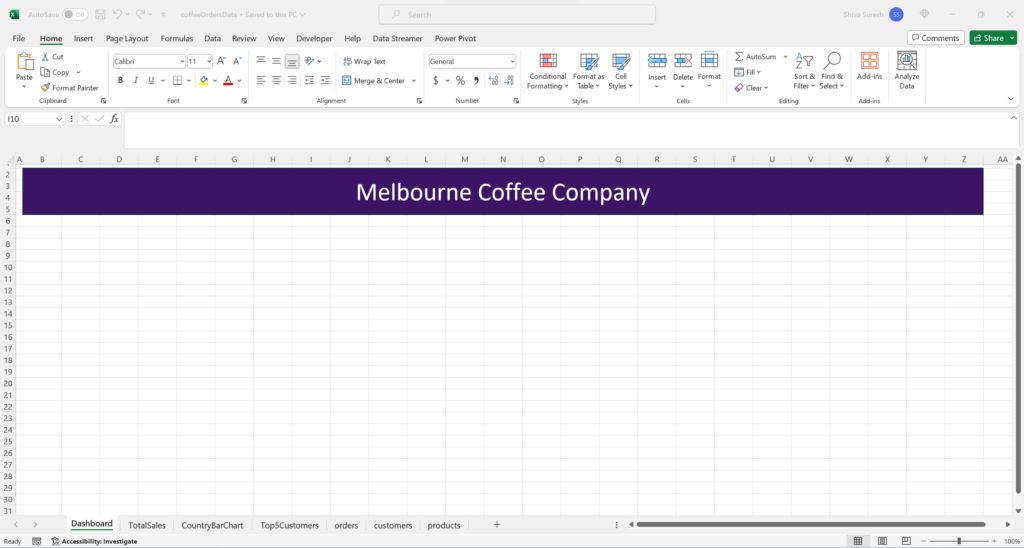
Next, we can just cut and paste the visualizations from the other sheets into the Dashboard sheet.
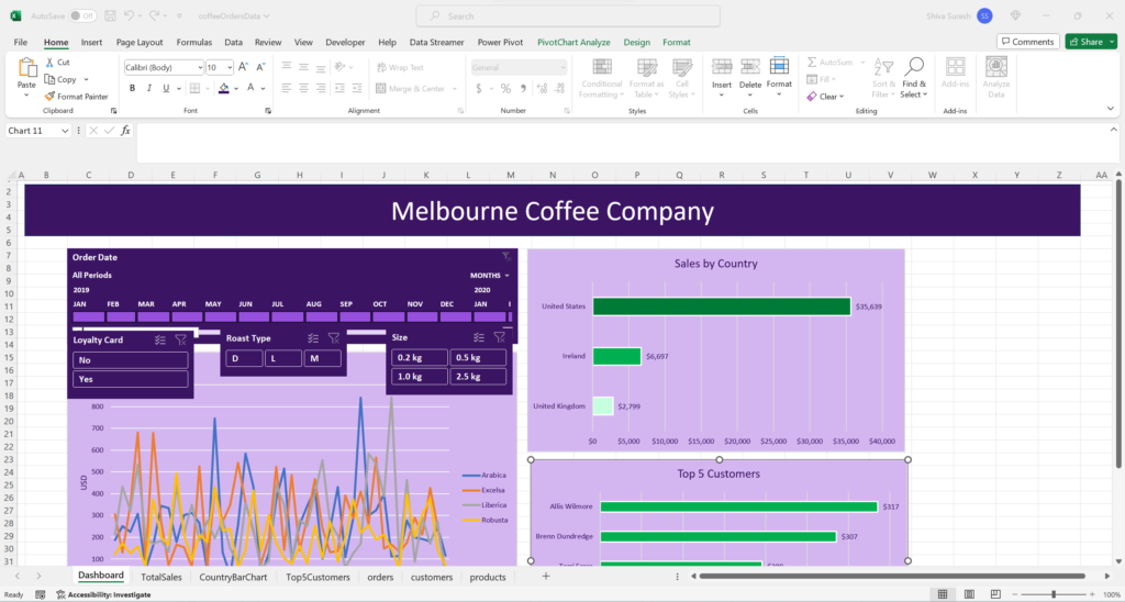
Then rearrange and resize the the visualizations into the dashboard.
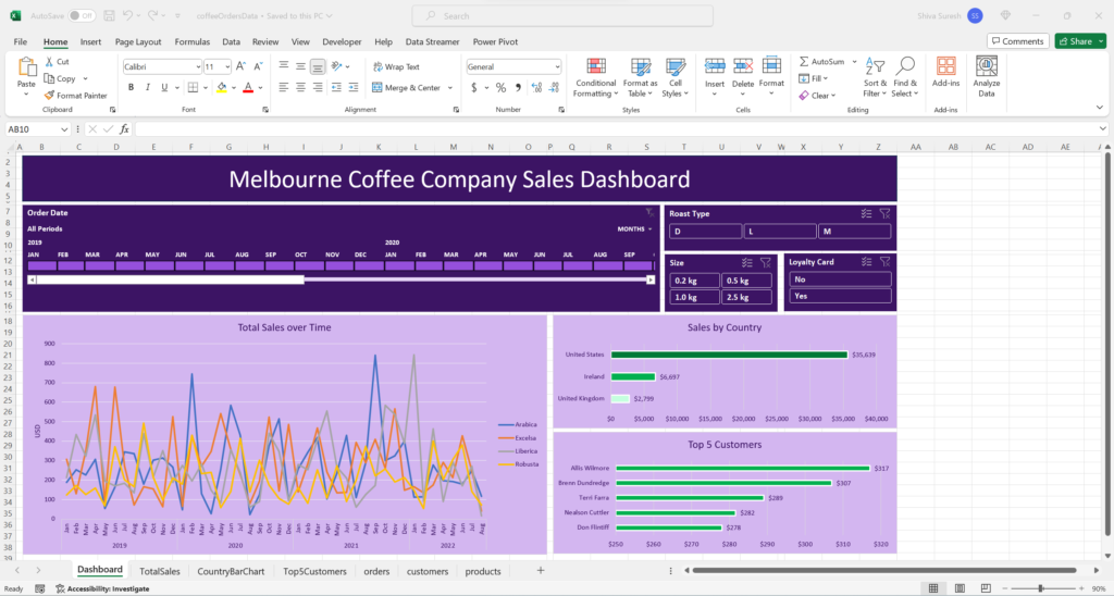
Currently, the timeline only filters the Total Sales over Time visualization in the dashboard. We want it to filter the Sales by Country and Top 5 Customers visualizations also. We need to configure the Report Connections for the Timeline by going to Timeline -> Report Connections which displays the Report Connections dialog box.
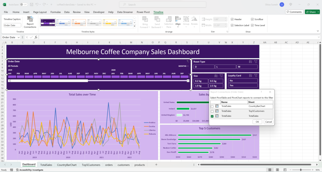
Check the boxes to connect the timeline to the CountryBarChart sheet and Top5customers sheet then click Ok.
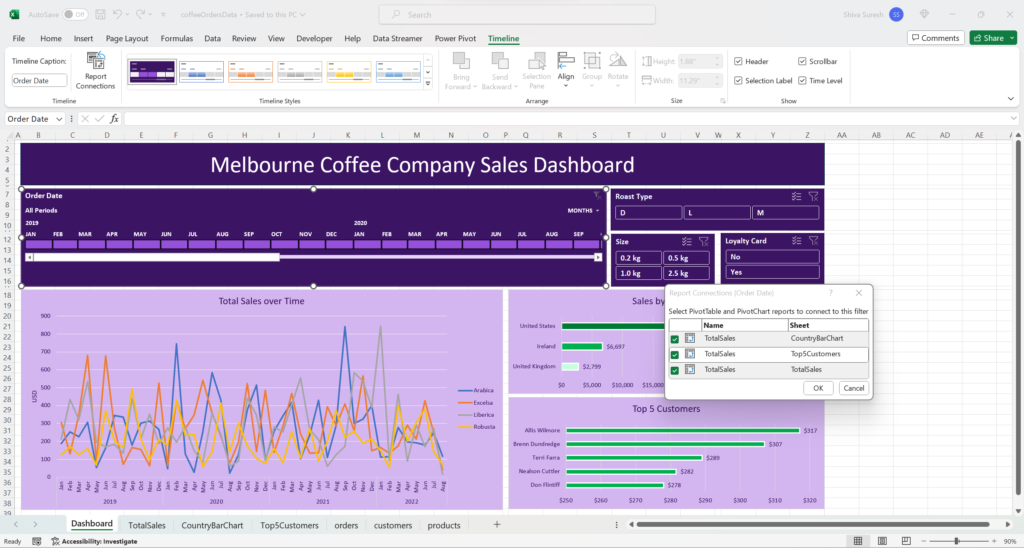
Now, the timeline filters all 3 visualizations. Similarly, we need to do the same thing with the slicers. Select the Roast Type slicer then go to Slicers -> Report Connections then select CountryBarChart and Top5Customers sheets then click Ok. This connects the slicer to all the visualizations.

Repeat these steps for the remaining two slicers. Now, the timeline and slicers are connected to all the visualizations. Our dashboard is now complete.

Now we can add some final touches. Go to View then uncheck Gridlines to remove the gridlines from the Dashboard worksheet.
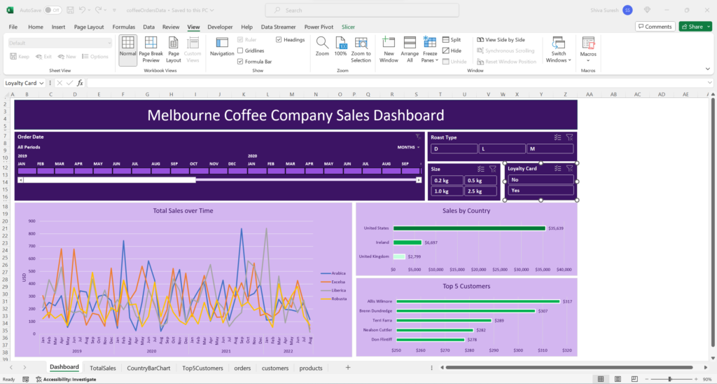
Next, double click the Home tab to hide the ribbon. Also, adjust the Zoom from 90% to 100%.
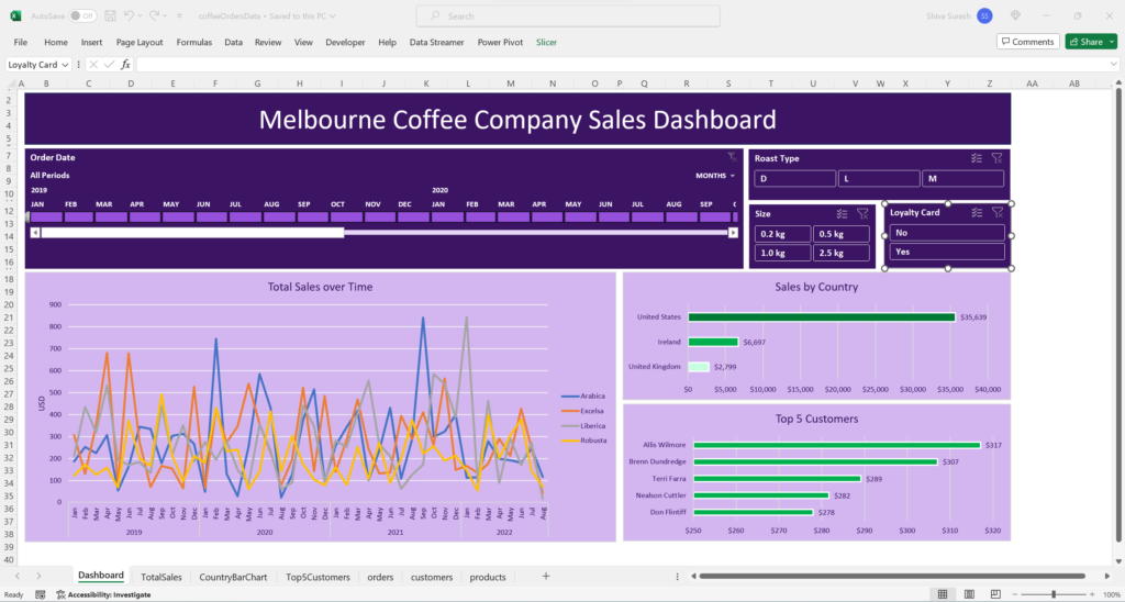
Finally, go to File – > Options -> Advanced. In the Display section, uncheck “Show Formula bar”. This hides the formula bar. Also, uncheck “Show sheet tabs” and “Show row and column headers” then click Ok. All these final touches polish up the dashboard’s appearance.
