Blog

End to end Data Project using Excel

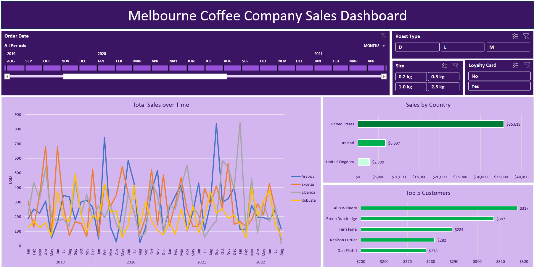
Intro In this end to end Excel data project, we gather data, transform it then use pivot tables and pivot charts to build a dynamic interactive coffee sales dashboard. Problem Statement Our stakeholders have requested a dashboard that analyzes the following:1. Total coffee sales over time by coffee type.2. Coffee sales by country3. Top customers […]

Category: Excel, Portfolio

HR Analytics Dashboard (Power BI)

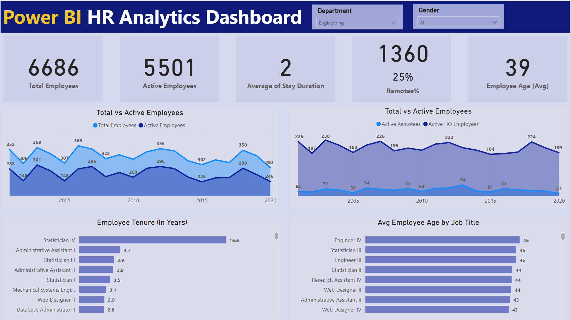
This HR Analytics dashboard enables stakeholders to monitor, measure, and understand: HeadcountEmployee retentionRemote employee %Avg employee ageEmployee tenure by positionAvg employee age by position Tools used: Power BI Key Business Insights:1. The company currently has 5,501 active employees.2. The average employee tenure is 2 years.3. 25% of employees currently work remotely.4. The average age of […]

Category: Portfolio, Power BI

Sales Performance Dashboard (Power BI)

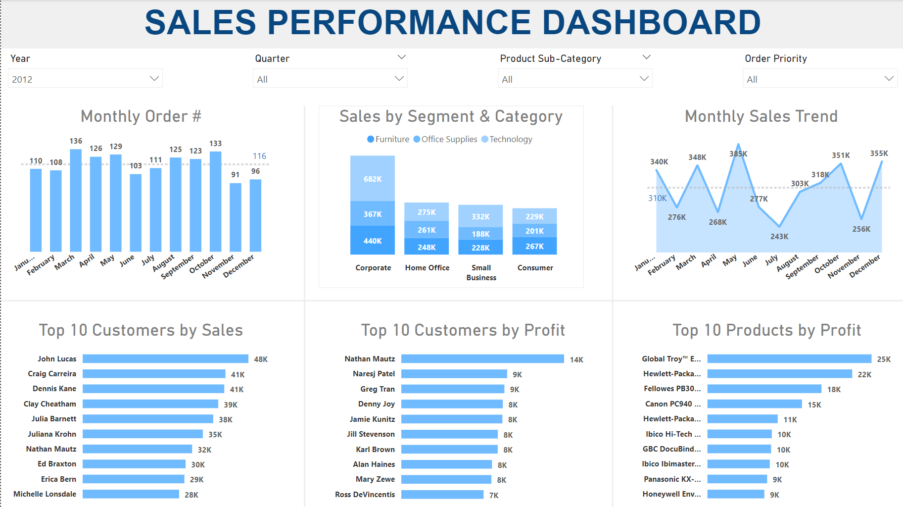
This Sales Analytics dashboard enables stakeholders to monitor, measure, and understand: Monthly sales order volumesSegment & product category compositionMonthly sales trendsTop customersMost profitable products. Tools used: Power BI 2012 Key Business Insights:1. The Corporate segment has the highest sales with the Technology category being the largest.2. John Lucas is the top customer but not among […]

Category: Portfolio, Power BI

Customer Analytics Dashboard (Power BI)

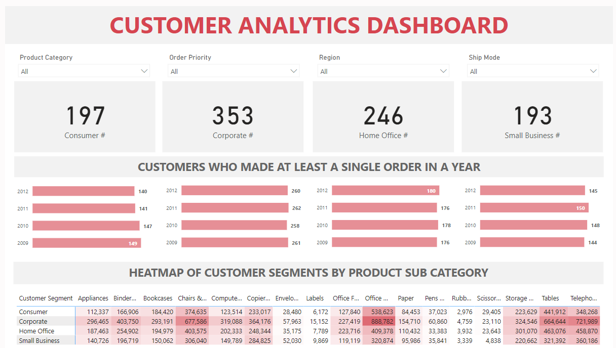
This Customer Analytics dashboard enables stakeholders to monitor, measure, and understand: Number of customers by segmentOrdering trends by segmentSales volumes by segment & product subcategories. Tools used: Power BI Key Business Insights:1. Corporate segment is the largest in terms of the number of customers.2. The Corporate segment also produces the most revenue.3. The Corporate Office […]

Category: Portfolio, Power BI

TV Ratings & Ad Costs Data Analytics using Python

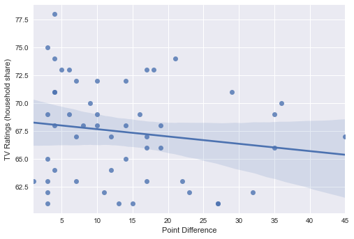
Introduction This data science project analyzes Super Bowl TV ratings data. The purpose is to gain insight into the following questions: 1. What are the most extreme game outcomes?2. How does the game affect television viewership?3. How have viewership, TV ratings, and ad cost evolved over time? We will briefly discuss the data, tools & […]

Australian Job Market

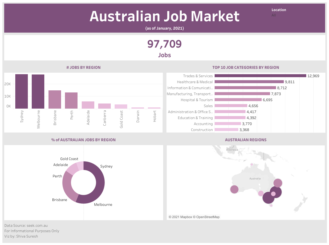
This Tableau dashboard utilizes data from seek.com.au to illustrate the Australian job market by number of jobs, region, and job category. The dashboard utilizes a variety of chart types including Bar, Donut, and Map. Some of the Tableau elements used were Filters, BANS, and calculated fields. Additionally, vertical and horizontal containers were utilized to achieve […]

Business KPI Dashboard (Tableau)

This Tableau dashboard utilizes Superstore data to illustrate various business KPIs related to Sales, Profit, Order Quantities, Customer Segments, Regional, and Product Categories. The dashboard utilizes a variety of chart types including Area, Bar, Stacked Bar, Donut, and Scatter Plot to convey the business insights. Some of the Tableau elements used were Filters, BANS, and […]